

When selecting a palette, the goal isn’t just “brightness”—it’s about reducing visual noise. Every time your eye hits a sharp contrast (like a dark sofa against a white wall), the room feels “choppy” and smaller.
1. The “Color Drenching” Technique
One of the most effective 2025 trends for small rooms is Color Drenching. This involves painting your walls, baseboards, and even the ceiling in the same color (or very similar shades).
- Why it works: By eliminating the high-contrast line between the wall and the ceiling, you remove the visual boundary of the room. The eye doesn’t “stop” at the ceiling line, making the walls feel infinitely taller.
- AI Tip: In your design tool, try a Warm White or Soft Taupe for this effect.
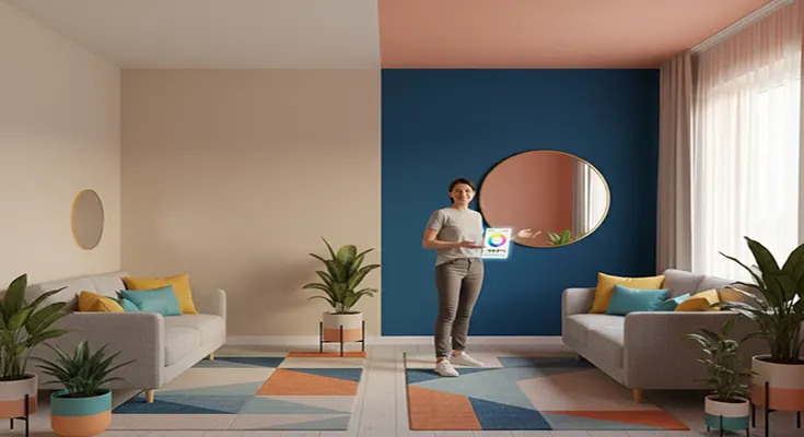
2. Follow the 60-30-10 Rule (Small Space Edition)
To keep a room from feeling chaotic, balance your colors using this classic ratio:
- 60% Primary (Walls & Rugs): Choose a light-reflective neutral (LRV of 60–75). This acts as your “foundation.”
- 30% Secondary (Large Furniture): Pick a color that is only two shades darker than your walls. For example, if your walls are oatmeal, your sofa should be a soft tan. This “low-contrast” approach keeps the room feeling open.
- 10% Accent (Decor): Here is where you add your personality. Use a bold “Pop of Contrast”—like a deep terracotta or navy—in small doses like pillows or artwork.
3. Receding vs. Advancing Colors
Understanding the “physics” of color can help you push walls back:
- Receding Colors (Cool Tones): Light blues, sage greens, and cool greys appear to “recede” from the eye. Use these on the longest wall of a narrow room to make it feel wider.
- Advancing Colors (Warm Tones): Reds, oranges, and deep yellows appear to “move toward” you. Avoid these on the far wall of a small room unless you want to create a “cozy, cocooning” feel (popular for small bedrooms).
Top 2025 Palettes for Small Spaces
| Palette Name | Wall Color | Furniture Finish | Best For… |
| The Airy Minimalist | Soft Off-White | Light Oak / Glass | Maximizing natural light. |
| The Earthy Modern | Sage Green | Walnut / Brass | Creating a “calming oasis” feel. |
| The Urban Loft | Light Grey | Matte Black / Steel | Giving a structured, clean look. |
| The Warm Sanctuary | Champagne / Sand | Cream Linen | Making a dark, north-facing room feel cozy. |
💡 Pro-Tip: The “Leggy” Furniture Rule
The color of your furniture matters, but so does its “visual weight.” To make your color palette work harder:
- Choose furniture with tapered legs rather than blocky bases.
- When you can see the floor color continuing underneath a sofa or cabinet, the AI-human brain perceives the room as larger because the “floor plane” is uninterrupted.